


Text stamps as “paper language”
A text stamp is essentially a tiny publishing system: it takes a phrase your team repeats all day and prints it in a consistent, readable way. Unlike logo-heavy designs, a text stamp works best when it behaves like good newsroom copy—short, unambiguous, and impossible to misread.
Think of it as a “headline” on a document. The stamp doesn’t explain everything; it tells the next reader what matters most right now.
Why teams rely on them
A well-chosen text stamp reduces decision friction and makes handoffs cleaner, especially when paperwork gets scanned, copied, or passed across departments. Stamps are often used to increase efficiency by standardizing office processing marks and reducing repetitive writing.
In practice, the value shows up in small moments:
- A front desk clerk doesn’t have to rewrite “received” fifty times.
- A finance team sees “PAID” and stops re-checking the same invoice.
- A coordinator stamps “NEEDS SIGNATURE” and routing becomes obvious without a meeting.
The wording rules (microcopy for real life)
Great text stamps read like crisp UI microcopy—direct, specific, and consistent.
Choose verbs over vibes
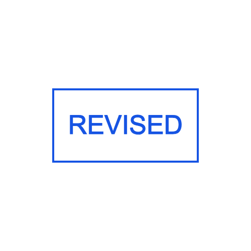
- Better: APPROVED, REJECTED, VOID, FILED
- Risky: “OK”, “DONE”, “CHECKED” (checked for what?)
Put the outcome first
People scan documents quickly. Lead with the action word, then add details:
- RECEIVED / Date / Initials
- PAID / Amount / Date
- IDENTITY VERIFIED / Method / Initials
Design for misunderstandings
If a phrase can be interpreted two ways, it will be—especially across time zones, new hires, or busy seasons. Prefer “PAYMENT RECEIVED” over “RECEIVED,” or “COPY PROVIDED” over “COPY.”
When to use an online workflow
Many teams now create stamps digitally before ordering anything physical, because it forces clarity and standardization.
- An online stamp design maker is ideal when you want structured layouts (main word + date line + initials box) without wrestling with design software.
- A simple stamp maker approach fits when you already know the phrase and just need clean typography and spacing.
- If you’re experimenting quickly—trying five variants of “APPROVED” wording—stamp generators can help you explore layouts fast before you finalize.
- If your team collaborates remotely, building a stamp stamp online first makes review and versioning much easier (everyone can agree on the wording before anything gets ordered).
Notice the theme: the tool matters less than the discipline. The stamp is only as good as the phrase you decide to standardize.
A practical “text stamp system”
Instead of creating random stamps one-by-one, build a small system of categories. This also helps your template library feel complete on a /text-stamp category page.
Status stamps (binary truth)
Use these when the document state has changed and shouldn’t be debated.
- APPROVED
- REJECTED
- PAID
- CANCELLED
- VOID
Routing stamps (next action)
Use these to eliminate “what happens next?”
- FOR REVIEW
- NEEDS SIGNATURE
- RETURN TO SENDER
- FOR FINANCE
- FILE COPY
Quality and operations
Use these for repeatable checkpoints.
- QC PASSED
- QC HOLD
- REWORK REQUIRED
- SAMPLE
- VERIFIED
Sensitivity and handling
Use these for document governance.
- CONFIDENTIAL
- INTERNAL USE ONLY
- DRAFT
- COPY
- ORIGINAL
Layout patterns that stay readable
A text stamp usually fails for one of two reasons: it’s overcrowded or it’s too light to survive scanning. Use patterns that make the stamp hard to mess up.
Pattern A: Big word + small metadata
Best for: APPROVED/PAID/RECEIVED
- Line 1 (largest): STATUS WORD
- Line 2: Date: ____ Initials: ____
Pattern B: Two-step action
Best for: routing and accountability
- Line 1: NEEDS REVIEW
- Line 2: Assigned to: ____ By: ____
Pattern C: Box stamp (form-like)
Best for: repeated data capture
- RECEIVED DATE: ____
- CASE ID: ____
- HANDLED BY: ____
Copy library (ready-to-template phrases)
Below are phrases that tend to work well in real departments because they are explicit and easy to scan:
- RECEIVED (DATE / INITIALS)
- PAYMENT RECEIVED
- INVOICE SENT
- ENTERED INTO SYSTEM
- CUSTOMER NOTIFIED
- FOLLOW-UP REQUIRED
- NEEDS REVISION
- SIGNATURE REQUIRED
- VERIFIED AGAINST ID
- COPY PROVIDED
- ARCHIVED
- DO NOT DUPLICATE
If you’re building a template set like your “business stamps” or “justice stamps” categories, the same idea applies: stamps work when the words reflect actual workflow steps, not generic labels.
Mistakes that make text stamps useless
- Too much text: If it can’t be read at a glance, it won’t be used.
- Ambiguous abbreviations: What’s obvious to one team is confusing to another.
- No place for initials/date: Accountability often matters more than aesthetics.
- Inconsistent wording across departments: “PAID” vs “PAYMENT RECEIVED” becomes a reconciliation headache later.
A simple checklist before publishing templates
Before you add a new text stamp template to /text-stamp, validate it like an editor would:
- Is the main phrase unmistakable?
- Would a new hire understand it with no extra context?
- Does it survive photocopying (thicker strokes, high contrast, generous spacing)?
- Does it imply a clear next step, or only a vague label?
- Can it be reused across teams without changing the meaning?
Suggested intro block for your category page
If you need a short top-of-page paragraph (above the template grid), this fits the “knowledge page” tone without sounding like an ad:
Text stamp templates help teams label documents with clear, repeatable meaning—so approvals, routing, filing, and quality checks stay consistent. Pick a phrase, choose a layout, and standardize your workflow with stamps that remain readable on paper and in scans.
If you share your planned template names (8–15 items), the wording can be tuned so the page naturally includes those phrases while keeping keyword density smooth and non-repetitive.