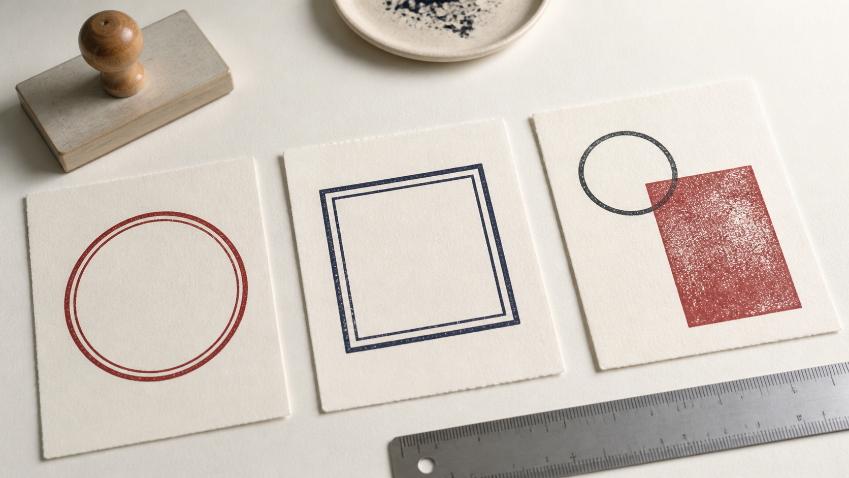
Stamp border design is easy to postpone because the border looks like a finishing detail. In a small impression, it is structural. A rule can hold curved text together, separate a name from an emblem, or give a user a visible edge for placement. It can also steal space, clog at the corners, and make a clear mark feel crowded. The useful question is not “Does this stamp need a border?” but “What specific work would the border do?”
Single, double, and borderless designs can all look complete. The right choice depends on the information, physical size, printing surface, and visual character. Begin with the content and its spacing. Add the lightest border that improves the design, then test several ordinary impressions rather than judging a perfect digital preview.
What stamp border design can accomplish
A border defines an outer silhouette. That makes a loose group of words and symbols read as one mark. It can also create a margin between the content and the surrounding document. On a busy form, the edge helps the impression hold its own. On a quiet card, the same edge may be unnecessary.
In a circular seal, an outer ring gives curved text a path and makes orientation visible. An inner ring can separate the perimeter name from a central symbol. In a rectangular status stamp, a border can emphasize the phrase and make the mark easier to locate on a page. In a logo stamp, however, the logo may already have a strong silhouette. Another enclosure can weaken it.
A border also affects production tolerance. It creates a large continuous element that reveals uneven pressure, ink buildup, or a rough surface. That feedback can be useful during testing. It also means the border may look worse than the central content when conditions are imperfect. A design should not require a flawless outline to remain understandable.
Define the border's job in one sentence. Examples include “contain the curved company name,” “separate the date field from the document,” or “help staff align the stamp with a box.” If the sentence is only “make it look finished,” remove the border temporarily and see whether spacing can provide the finish instead.
Use a single border as the working default
A single border is usually the easiest enclosure to control. It defines the mark without creating a narrow channel of empty space. It leaves more room for text than a double border and is simpler to balance against a logo. Start with one rule when the content needs containment, then adjust weight and margin together.
The rule should not be the darkest element by accident. If the border is heavier than the business name or central symbol, the eye meets the container first. That may suit a blunt status mark, but it can make a company or maker mark feel like an empty box. Compare the visual weight of the full perimeter with the total weight of the content, not just one short segment.
Give the border an inner margin. Text touching the edge is harder to read, and small production variation becomes obvious. In a round design, check the top and bottom of curved letters as well as the side spacing. In a square design, inspect the corners, where a diagonal letter or logo point may approach the frame even when straight text looks comfortable.
A single border can be open or closed in character. A thin rule with generous spacing feels quiet. A moderate rule close to bold type feels direct. Rounded corners soften a rectangle; sharp corners reinforce its grid. Make those choices after the information hierarchy works, since the same border can feel different around different content.
Choose a double border only when the gap has a purpose
A double border creates three things at once: an outer edge, an inner edge, and a channel between them. That channel can establish formality, echo an existing seal, or separate perimeter text from a central field. It also consumes valuable area. At small sizes, two thin rules may merge or print unevenly, while two heavy rules can dominate everything inside.
Use a double border when the inner and outer rules create a meaningful zone. A company name may sit between rings. A central emblem may need a protected field. A traditional identity may already use a paired outline. Avoid adding the second rule merely because the canvas has empty space. Useful negative space is not unfinished work.
Balance the pair as a unit. Two equal rules feel stable but can become visually heavy. A slightly stronger outer rule and quieter inner rule can clarify the hierarchy, provided the difference survives printing. Keep enough gap that ordinary ink spread does not turn the pair into one thick band.
Double borders demand early physical proofs. Zoomed screens exaggerate the gap and make both rules appear cleaner than they may be in an impression. Print at actual size, then stamp on the smoothest and roughest common surface. If the gap disappears on the latter, simplify rather than expecting perfect technique every time.
Let a borderless stamp use its natural silhouette
Borderless does not mean unstructured. A strong wordmark, emblem, monogram, or compact stack can define its own edge. Removing the frame gives the content more room and can make the impression feel lighter. It is often effective when the stamp should behave like a maker's mark rather than an official seal.
Spacing becomes the container. Align the elements so their outer edges form a deliberate shape. A centered name over a symbol may create a stable triangle. A wordmark and short subline may form a clean rectangle without drawing one. Keep irregular decorative details from creating an accidental ragged edge.
Borderless designs need a clear placement method. Without an outline, the user may have less feedback about the outer footprint. The physical mount can provide that cue, or a dominant baseline can align with the document. Test placement during the real task rather than assuming the missing frame has no operational effect.
A borderless mark can also sit more comfortably near existing document lines. A boxed stamp placed inside a printed box creates competing edges. Removing its border may let the content integrate cleanly. Conversely, a border may be helpful on an unstructured page where the mark needs to be found quickly.
Match border shape to content shape
Do not force a round border around content that reads as a wide paragraph. The result leaves empty side wedges and squeezes the longest lines through the center. Do not force a square border around a compact circular emblem if the corners remain purposeless. The enclosure should follow the content's natural silhouette or provide a clear contrast for a reason.
Curved perimeter text needs a circle or oval with enough radius for comfortable letters. A rectangular frame supports straight rows, columns, and fields. An irregular logo may need no border, or it may benefit from a simple shape that gives it consistent clearance. Test the content without a frame to reveal its underlying geometry.
Consider the landing area as well. A circular border may fit a centered certificate space. A rectangular border can align with a form cell. A square seal can occupy a packaging corner. The shape should respect both the content inside and the visual environment outside.
Explore the custom seal templates and company seal layouts with the borders temporarily hidden. Notice which designs keep their hierarchy. That exercise helps separate necessary structure from familiar decoration.
Set border weight in relation to type and size
There is no universally correct border thickness. A useful rule is relational: the border should belong to the same visual system as the lettering and symbol. A hairline around bold capitals feels fragile. A heavy frame around fine type feels like a barrier. Begin near the dominant stroke weight, then adjust after a physical proof.
Remember that the perimeter contains much more ink than a single letter stroke. Even when their measured thickness matches, the border can appear darker because it is continuous. Step back from the proof and squint. If the first thing you see is an empty ring or box, reduce the border or strengthen the intended focal point.
Small stamps need special restraint. As the outside dimension shrinks, the border occupies a larger share of the usable field. Preserve inner space before preserving decorative complexity. One clear rule usually outperforms two delicate rules that depend on ideal printing.
Large stamps can carry more separation, but they still need balance. A very thin outline may look disconnected from large text. Increase weight gradually and test on the real material. Large solid borders also demand even pressure, so visual boldness has a mechanical cost.
Protect the inner margin
The inner margin is the quiet space between the border and the nearest content. It keeps the mark readable and absorbs small differences in pressure, trimming, and placement. Treat it as a real component, not leftover space.
Measure the tightest point, not the average. Curved letters may approach a ring at the top. A logo point may reach toward a square corner. A descender may sit closer to the lower border than the capital letters appear. Rotate your attention around the entire frame.
Use optical spacing as well as numerical spacing. A circular emblem can appear closer to a border at one point because of its internal mass. A word ending with a narrow letter may look farther from the edge than a word ending with a broad one. Small adjustments can make the margin feel even without making every measurement identical.
If the design will be produced at several sizes, do not scale the border and margins blindly. A proportion that works at a large size may become too delicate or cramped when reduced. Prepare size-specific versions when the difference is meaningful.
Proof border weight under normal ink pressure
A border test should include imperfect impressions. Apply the normal amount of ink and pressure used in the real workflow. Make several marks in a row. Look for gaps at the far edge, buildup in corners, merged double rules, and places where the border touches text.
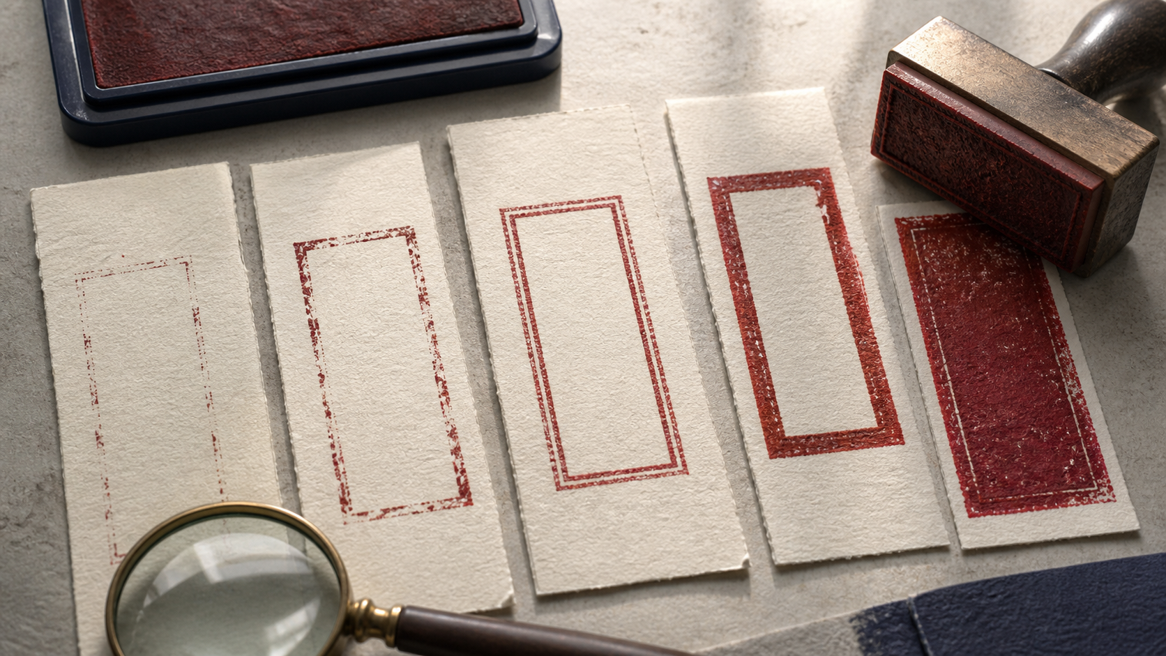
Repeat the test on different paper. Smooth stock may show every fine rule. Textured stock can break a thin border and make a heavy one look more appropriate. An absorbent surface may spread the ink. The goal is not identical appearance on every material; it is a mark that remains understandable across the materials you actually use.
Judge the design after the ink settles as well as immediately after stamping. Keep the proofs with notes about the paper and ink. A small proof sheet becomes a useful reference if the stamp is reordered or adapted later.
If the border fails while the content remains clear, simplify the border first. If the border prints perfectly but the small text closes, the frame is not the success metric. Protect the information hierarchy.
Separate physical and digital border needs
A digital stamp image does not experience uneven hand pressure, but it has its own limits. Thin lines can become faint when the image is reduced, compressed, or viewed against a busy scan. Heavy borders can make a small on-screen mark feel louder than intended. Check the image at the size it will occupy in the document, not only at full resolution.
A physical stamp may benefit from slightly sturdier rules and larger gaps. A digital version may preserve finer detail. Keep one visual identity but allow production-specific adjustments. The goal is equivalent clarity, not pixel-for-pixel sameness.
Transparent backgrounds make the outer edge especially visible. Inspect the border on white, light color, and a representative scanned page. Make sure there is no unwanted box, halo, or cropped edge around the exported image.
If the same stamp will be used both ways, build a clean source in the StampDr design editor and save separate exports or production files. Name them by use so a low-resolution document image is not accidentally sent for physical production.
Common border mistakes
Adding a second rule to fill empty space
Empty space may be protecting the content. Remove the second rule and compare physical-size proofs. Keep it only when the new channel organizes text or supports an established identity.
Matching measured weights without checking visual weight
A continuous border can look darker than lettering with the same stroke thickness. Compare the whole impression from normal viewing distance and adjust optically.
Making the margin equal everywhere on paper but uneven to the eye
Symbols and letter shapes distribute mass differently. Correct the tight-looking points while preserving a coherent center. Optical balance is the final test.
Using corners as storage
A square frame can tempt the designer to add dots, stars, dates, or codes in every corner. Add only information that serves the task. Quiet corners can make the main content clearer.
Assuming a clean screen line will print cleanly
Print at final size and make repeated impressions on actual material. If a rule is essential, it must survive that test. If it is not essential, simplify it before shrinking the content.
A step-by-step border decision
- Complete the content hierarchy without a border. Establish the name, symbol, and supporting information first.
- Name the border's job. Containment, separation, alignment, or a required identity cue are specific jobs.
- Add one simple rule. Set a comfortable inner margin and compare its weight with the dominant content.
- Test a borderless version. Make sure the rule truly improves the impression.
- Test a double version only if a second zone helps. Keep the gap open at final size.
- Print and stamp several proofs. Use normal pressure on the real surfaces.
- Choose the simplest version that stays clear. Record dimensions, weights, gaps, and production notes.
The design stamp examples can supply starting geometry, but perform this sequence with your own content. A border that suits a short sample word may fail around a long organization name.
Examples of the three choices
Single border: a receiving-status stamp
A direct phrase and date area need to be found quickly on busy paperwork. One rectangular rule defines the footprint and aligns with form fields. A double rule would reduce writing space without adding a new information zone.
Double border: a compact company seal
The organization name follows the perimeter, while an emblem occupies the center. Two rings can create a clear channel for the name and protect the central field. The gap must remain open in actual-size proofs.
No border: a maker's logo mark
A recognizable symbol and short wordmark already form a coherent silhouette. Removing the frame gives them more room and keeps the impression light on packaging or cards. The mount needs a clear orientation cue.
These are patterns, not fixed categories. A company seal may work with one border, and a status mark may work without one when it sits inside a printed box. Let the information and landing area decide.
Finish by removing what the stamp does not need
You should be able to explain a successful border quickly: it holds related elements together, creates a useful zone, or helps the mark land consistently. It should not make the text shrink, dominate the focal point, or depend on perfect pressure.
Build the content first, add one rule, and print it at final size. Compare that proof with a borderless version and, only when justified, a double version. Keep the option that improves recognition under ordinary use. The stamp will feel more finished because every line has a job.
