
A stamp can look perfectly balanced on a large monitor and still feel cramped when it is printed at 25 millimeters. That gap between screen size and physical size is where many otherwise good designs fail. Small text closes up, thin borders disappear, and a logo that looked restrained begins to compete with the company name. Choosing a stamp size is therefore not a decorative decision. It is a practical decision about the document, the amount of information, the printing method, and the distance from which the mark must be read.
This guide starts with the finished document rather than a generic size chart. A compact approval mark on an invoice has different needs from a company seal on a certificate. The useful question is not “What is the standard stamp size?” but “What is the smallest size that keeps every required detail clear in its real setting?” Once that question is answered, the editor becomes a place to refine a known target instead of guessing.
Begin with the space available on the document
Measure the area where the stamp will normally appear. Do not measure the entire blank corner of a sample page if that space might contain a signature, date, or handwritten note in everyday use. Look at several real documents and identify the dependable clear area. On an A4 invoice, that may be a rectangle beside the approval line. On a certificate, it may be a centered area below the main text. On packaging, it may be constrained by a label rather than the package itself.
Leave breathing room around the impression. A stamp that fills every available millimeter looks crowded even when none of its elements are technically clipped. As a working rule, reserve at least two or three millimeters between the outer border and nearby printed content. More space is helpful when the document has a dense layout or when a person will add a signature beside the mark.
It also helps to print a plain outline at the proposed dimensions before completing the design. A 38-millimeter circle on paper often feels smaller than the same circle on a zoomed canvas. Cut out the outline, place it on a typical document, and check whether it looks intentional. This quick physical test prevents hours of adjusting typography inside a footprint that was wrong from the start.
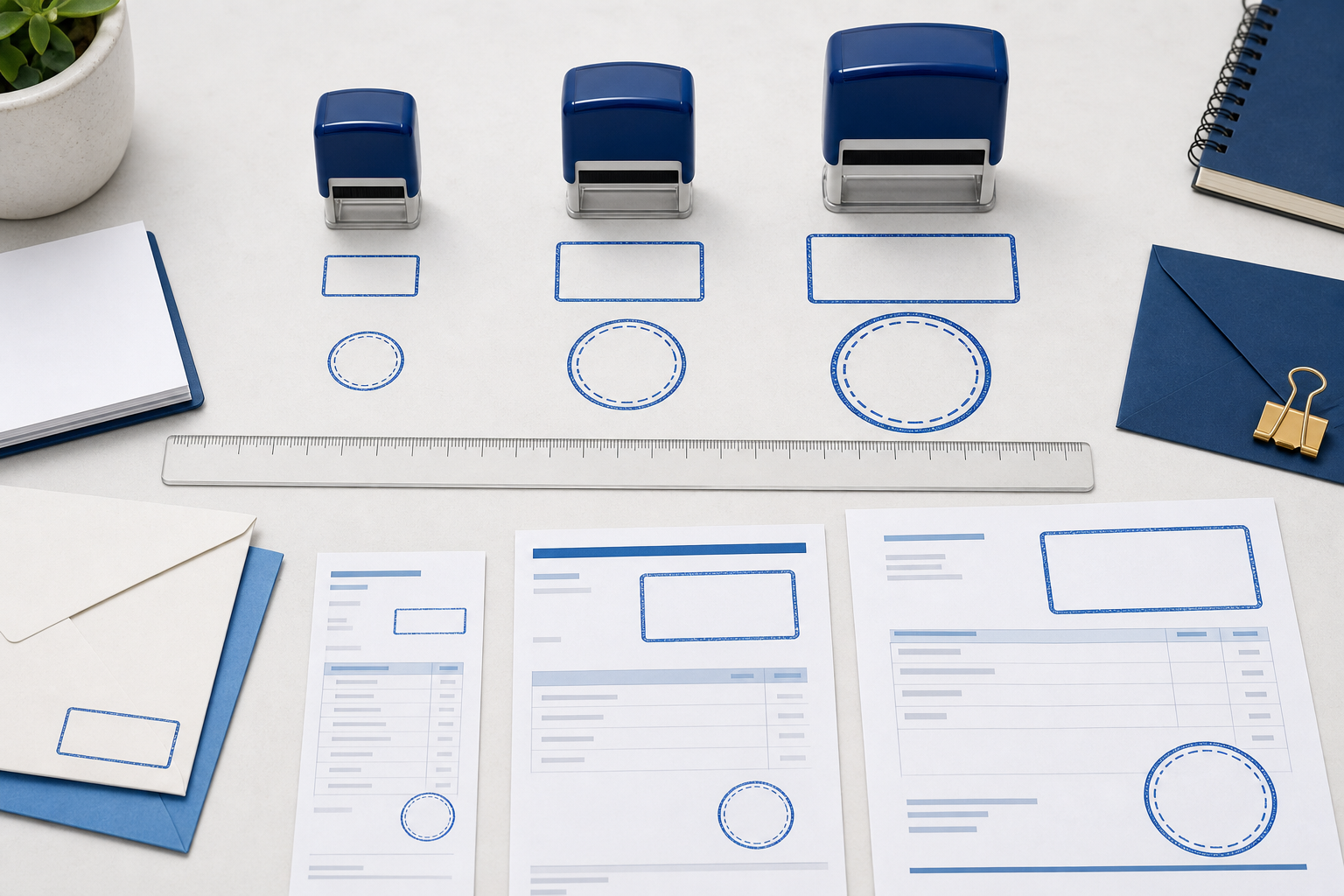
Common size ranges and what they suit
There is no universal size that every stamp maker or print shop follows, but several ranges are useful as starting points. Small round stamps between roughly 20 and 25 millimeters work for initials, compact inspection marks, loyalty cards, and simple one- or two-line identifiers. They are not a comfortable home for a long legal name, an address, and a registration number at the same time.
Round stamps around 30 to 40 millimeters cover many business uses. This range can usually hold a company name around the perimeter, a short identifier or icon in the center, and a restrained border. A 38-millimeter plate is common because it offers enough room for recognizable type without becoming dominant on a letter or invoice. The exact result still depends on the typeface and the number of characters.
Larger circular marks from about 45 to 60 millimeters are better for formal seals, certificates, event marks, packaging, or designs with multiple rings of information. The extra space supports hierarchy: a main name can be prominent while a location, department, or registration line remains secondary. Beyond that range, the mark becomes a graphic feature rather than a routine office stamp, so test it against the page carefully.
Rectangular stamps are best described by both width and height. A compact 35 by 15 millimeter mark may suit “received,” “approved,” or a short address. A 55 by 20 millimeter plate can carry two or three concise lines. Wider plates are useful for signatures, return addresses, and bank details, but a very wide and shallow design can be difficult to position evenly by hand. Choose proportions that fit the content rather than stretching the content to fit a familiar housing.
Count information before choosing a diameter
Make a list of what the impression must communicate. Separate required information from optional decoration. A legal company name may be required; a slogan may simply be nice to have. A registration number may matter on one workflow but add noise on another. If the list contains five equally important items, increasing the diameter will not fully solve the problem. The design also needs hierarchy.
For a small business mark, a practical hierarchy might be company name first, location second, and a simple icon third. For a date stamp, the date field must remain the clearest moving part. For a professional seal, the organization name and jurisdiction may belong on separate arcs. Create the hierarchy before opening the editor, then give the largest type and strongest position to the information that must be recognized first.
If the content cannot be shortened, consider splitting one overloaded stamp into two purpose-built stamps. A compact approval stamp and a separate address stamp are often easier to use than one large impression containing both. This is not wasted duplication. Each tool becomes faster to place and clearer to read.
Set a minimum readable type size
Typeface choice changes the amount of information a plate can hold. Narrow type fits more characters but may close up when ink spreads. Bold type survives uneven paper but consumes space quickly. Decorative type can look distinctive at poster size and become a blur at stamp size. For small impressions, begin with a sturdy, open typeface and avoid extremely light strokes or compressed letterforms.
There is no single minimum point size because the physical output depends on the font, the stamp material, and the printer. A useful proofing method is to print the design at 100 percent size with several text treatments. Include the intended weight and one slightly heavier option. Read the result under ordinary office light, then ask someone who did not build the design to read it without explanation. If they hesitate over a word or number, the text needs more space, more weight, or fewer characters.
Curved text deserves extra attention. Letters along a tight arc change orientation rapidly, and the spaces between them can feel irregular. A long name on a small circle may technically fit while becoming tiring to read. Increase the diameter, reduce the character count, or relax the curve. Do not solve the problem only by shrinking the type.
Allow for ink spread and real paper
A digital preview draws perfect edges. A physical impression does not. Ink can spread slightly into uncoated paper, skip across textured stock, or build up in narrow gaps. A self-inking unit, a traditional rubber stamp, and a print-shop plate may also produce different results from the same artwork. The smaller the detail, the more these differences matter.
Protect small counters—the empty spaces inside letters such as “a,” “e,” and “o”—by avoiding unnecessarily heavy type. At the same time, avoid hairline borders that may break. Keep a visible gap between parallel rings, and do not place tiny dots so close that they merge into a solid band. If a symbol contains several internal lines, simplify it for stamp use rather than treating the original logo file as untouchable.
Paper is part of the design system. Coated labels can hold fine detail, while recycled paper may soften it. Carbonless forms and rough cartons need bolder marks than smooth letterhead. Proof on the least forgiving stock used in the workflow, not only on bright copier paper. If the design works there, it will usually work on the easier surfaces too.
Match the shape to the task
A round stamp naturally supports seals, badges, certifications, and company marks. Its perimeter creates a strong enclosure and makes curved names feel intentional. It also uses space less efficiently for long addresses or several horizontal data fields. A rectangular stamp is usually clearer for addresses, signatures, routing instructions, bank information, and repeated form entries.
Oval marks sit between those two behaviors. They retain the formal feeling of a seal while creating more horizontal room for a long organization name. Square marks can feel modern and make efficient use of a compact area, but their corners make alignment errors more noticeable. Choose the shape that follows the reading pattern of the content.
If the main purpose is a changing date, start from a layout made for that task rather than forcing a date into a decorative badge. The date stamp templates provide useful examples of how to leave a clear central field while keeping supporting text secondary.
Use resolution correctly
Resolution matters when a design is exported as a raster image. It describes how many pixels are available across a physical measurement. A file can have a large pixel count and still be the wrong physical size if its resolution metadata is misunderstood. Conversely, a vector file can scale without the same pixel limitation, though line thickness and readable type still need physical proofing.
For ordinary professional printing, 300 pixels per inch is a sensible baseline for raster artwork. At that resolution, a 40-millimeter design needs roughly 472 pixels across. A 10-times export gives much more pixel data for specialized workflows, but it does not rescue weak spacing or tiny text. More pixels preserve the design; they do not redesign it.
Keep the final physical dimensions in the order notes or file name so the production team does not have to infer them. If the artwork is 1600 pixels wide, that number alone does not say whether the intended plate is 30, 40, or 60 millimeters. A short note such as “final diameter 38 mm” removes ambiguity.
Design at the intended plate size
Open the online stamp design workspace with a target size already in mind. Set the plate size, choose the overall shape, and place the outer border first. The border defines the usable interior and makes it easier to judge whether the remaining space is realistic. Add the primary text next, then secondary text, then any icon or decorative separator.
Resist the urge to fill every empty area. White space inside a stamp is not unused capacity; it separates information and helps inked shapes remain distinct. Increase gaps before adding decorative stars, dots, or extra rings. If the design still feels balanced without an ornament, leave it out.
Review the design at two zoom levels. Use a large view to catch alignment and spacing errors, then view it close to its actual physical size. The large view tells you whether the construction is precise. The small view tells you whether the impression communicates.
Build a simple paper proof
Export or screenshot a clean preview and place several copies on a page at exact size. Include the chosen size plus one version slightly smaller and one slightly larger. Print without “fit to page” scaling. Measure the printed outline with a ruler to confirm the printer did not change it.
Place each proof where the real stamp will be used. Check nearby signatures, table borders, form labels, and folds. A size that looks ideal in isolation may crowd a signature block. A slightly smaller option may feel better on invoices, while the larger version may be more authoritative on certificates. If both contexts matter, save separate versions instead of accepting a compromise that is mediocre in each.
Mark the proof with a pen as if it were part of the actual process. Add a date, initials, or approval note. This shows whether the stamp leaves enough room for the human action around it. Good office tools support the workflow instead of merely occupying space on the page.
Check borders, gaps, and alignment
Measure the visual relationships, not only the outer diameter. The gap from the outer border to curved text should feel consistent. The center icon should sit optically in the middle, which may not be the exact mathematical center if the upper and lower text have different weights. Parallel rings need enough separation to print as separate lines.
Turn the design temporarily to a single dark color on a white background and inspect its silhouette. If one area becomes a heavy block while another looks fragile, rebalance the weights. Reduce or enlarge the design only after fixing those internal relationships. Scaling a poorly balanced stamp makes a larger or smaller version of the same problem.
For production-oriented checks, the article on print-shop stamp proofing practices explains why clear specifications and repeatable proofs reduce rework between the browser and the finished plate.
Choose the export around the next step
If the file will be inserted into a document or used as a digital mark, a transparent PNG may be enough. If a print shop needs to resize or cut the artwork, SVG or EPS may be more useful. PDF can preserve a placed proof at a known page size. The correct choice depends on who receives the file and what software they use.
Ask the production provider before purchasing or exporting if their requirements are unusual. The available download options and plans separate common raster, vector, and document packages, so select the package that matches the actual handoff rather than paying for formats no one in the workflow will open.
Name the file with the intended size, shape, and version. “Acme-seal-38mm-final.svg” is safer than “stamp-new-3.svg.” Keep the editable design and the approved export together. If the plate is reordered months later, the size and approved artwork remain obvious.
A practical size decision
Choose the document area first, list the required information, and decide which item must be read first. Select a shape that follows the content, then test the smallest size that keeps the type, counters, borders, and gaps distinct on real paper. A paper proof is more trustworthy than a zoomed preview, and the most difficult paper stock is a better test than the smoothest.
The right stamp size is not the largest option that fits the page. It is the size that looks deliberate, leaves room for the surrounding workflow, and prints reliably without asking the reader to study it. When the physical target is clear before the artwork is finished, every later choice—font, border, spacing, export, and production note—becomes easier to judge.
Save the decision for the next reorder
Once a size is approved, record more than the outer dimension. Save the plate width and height, the housing or product used, the ink color, the final file, and a photo or scan of a good impression on the normal paper. Those details make a replacement straightforward and provide a reference when someone asks for a “slightly smaller” version later.
If several departments need related stamps, create a small size system rather than choosing each one in isolation. For example, routine status marks can share one compact plate, address stamps can share one rectangular proportion, and formal seals can share one diameter. Consistent sizing makes storage, ordering, and document placement easier without forcing every design to contain the same information.
