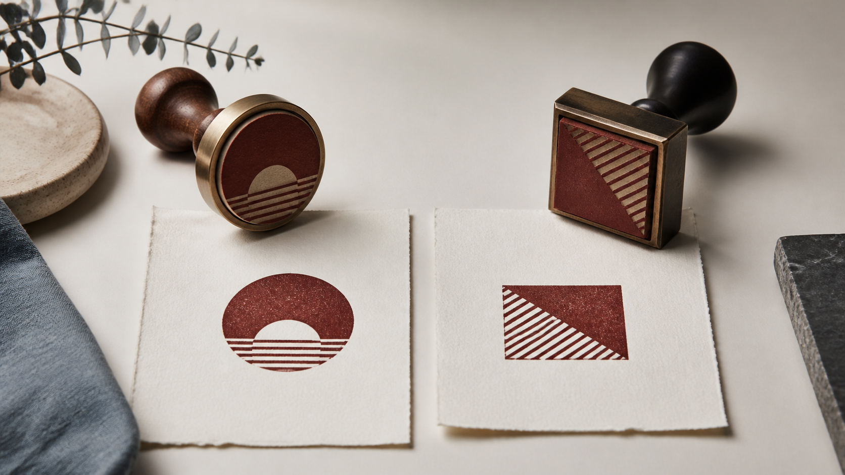
The round vs square stamps decision looks like a matter of taste until real content enters the frame. A short name can sit comfortably around a circle. A stacked address may need straight sides. A compact logo might work in either, while a long approval phrase fights one shape from the start. The best choice is the shape that gives the required information a natural structure at the size and location where the stamp will be used.
That shifts the question from “Which shape looks better?” to “Which shape asks the fewest compromises of this content?” Compare the name, logo, line lengths, landing space, and stamping routine before choosing. Brand personality still matters, but it should break a close tie rather than force a layout that is difficult to read.
Round vs square stamps in one practical rule
Choose a round stamp when the content has a center and can form rings, arcs, or a compact emblem. Choose a square stamp when the content wants rows, corners, alignment, or a block-like reading order. This is not a production law. It is a layout shortcut that reveals where each shape begins with an advantage.
A round mark naturally creates a focal point. The eye enters near the middle and follows the perimeter. That works well for a symbol, initials, a short company name around an edge, or a small central phrase. A square creates an even field with four usable corners. It accepts stacked words, grids, and left or centered alignment without asking the outer text to curve.
Both shapes lose usable space near their boundaries. A circle narrows quickly at the top and bottom, so long horizontal lines must sit near the center. A square preserves width across most of its height, but content pushed into its corners can feel cramped. The right comparison uses the inner safe area, not just the outside dimension printed on a product description.
If the content is undecided, sketch it in both shapes at the same outer width. Do not perfect either version. Use simple boxes for a logo and plain lines for text. The option that reaches a readable hierarchy with fewer awkward gaps is probably the better starting point.
Start with the geometry of the content
List the elements before choosing a silhouette. A typical stamp may include a logo, organization name, location, date, status, identifier, or border. Classify each item as central, linear, or peripheral. A monogram is central. An address is linear. A company name that can wrap around an emblem is peripheral. The mix shows which shape can organize the content honestly.
Round stamps favor one dominant center with supporting information outside it. Problems appear when several long lines all demand the center. The designer shrinks the type, bends words too sharply, or creates unused wedges on the sides. If the essential content reads like a short paragraph, the circle is working against it.
Square stamps favor a sequence. A name can lead, a logo can sit above or beside it, and supporting details can occupy the remaining rows. Problems appear when the design is only a small circular symbol placed in a large square. The empty corners may feel accidental, tempting the designer to fill them with decorations that serve no purpose.
Look at the silhouette of the logo as well. A wide wordmark often needs a square or rectangular field. A compact crest, seal, flower, face, or monogram can settle naturally inside a circle. An abstract logo with balanced width and height may work in both. Never distort a logo to make it obey the stamp shape; change the surrounding layout instead.
Compare the real landing space
The document or object may choose the shape before branding does. A certificate often leaves a square or circular open area near a signature. A narrow packaging label may offer a corner that suits a small square. An envelope flap may welcome a round mark, while a sender block on the front follows a rectangular rhythm. Measure the dependable empty area on the real item.
Do not assume a visually open space is mechanically safe. Folds, curves, seams, label edges, and textured patches can interfere with pressure. A circle can sometimes sit comfortably on a small centered area because its corners are absent. A square can use a rectangular region more efficiently because its edges align with the surrounding layout.
Leave clearance around the impression. A square jammed into a square label looks like a printing error. A circle touching a nearby line loses its clean outline. Cut paper outlines at the proposed dimensions and place them on several real items. This simple test also shows how the shape relates to other geometry already present, such as boxes, photos, and typography.
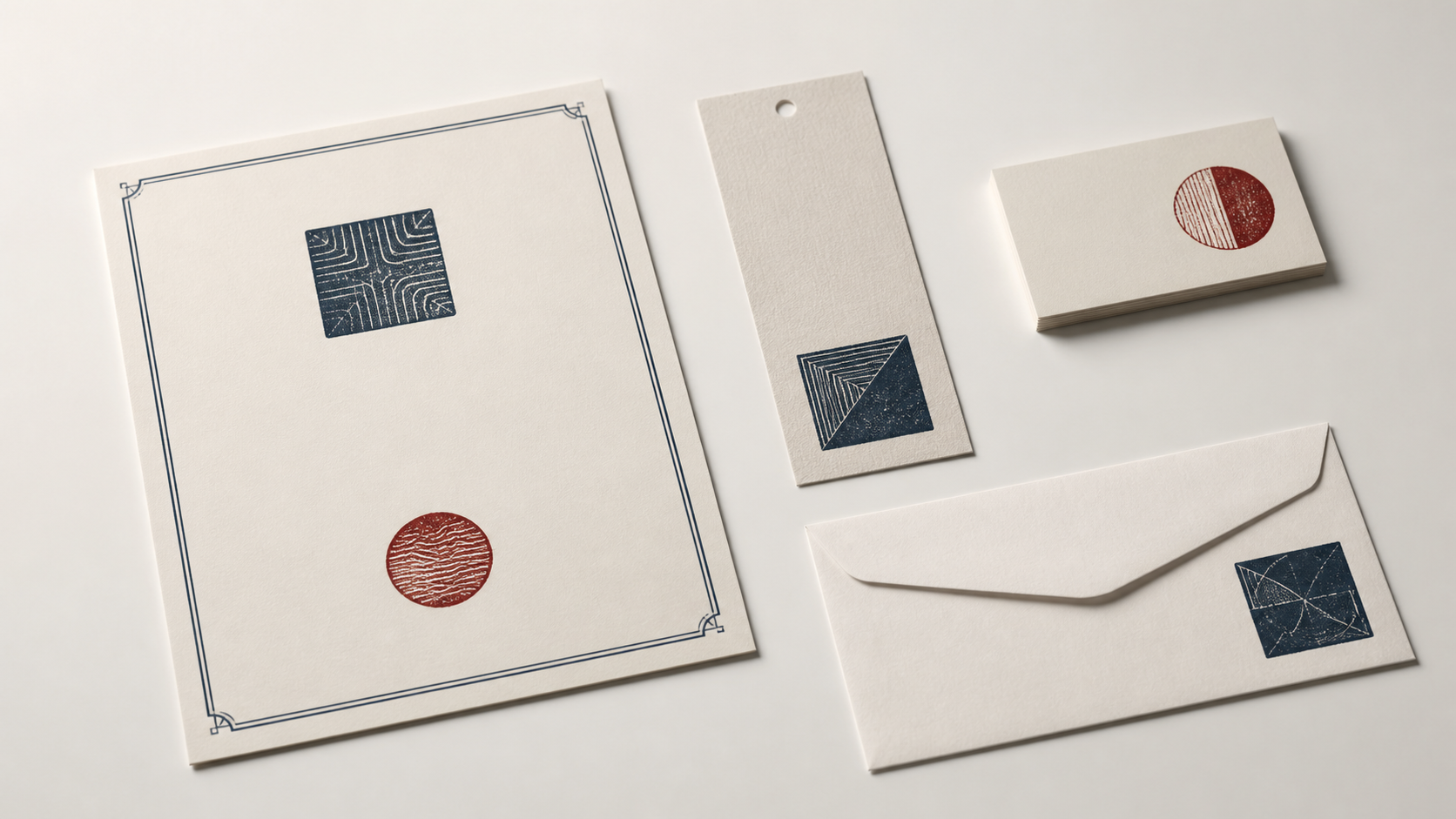
Placement frequency matters too. A mark used once on a presentation piece can tolerate careful positioning. A receiving stamp used hundreds of times needs an obvious landing zone and a shape staff can orient quickly. The best-looking option in a mockup may not be the easiest option during a busy workflow.
Think about reading order
A round layout often asks the reader to decode an arc, find the top, and then move to the center. That is acceptable for a name or familiar phrase. It is less helpful for instructions, multi-part status text, or information that must be scanned in a fixed order. If someone needs to read line one before line two, straight alignment is usually calmer.
A square layout can still have an unclear reading order. Four corner elements, a center logo, and two border labels may produce several competing starts. Use the square's grid to simplify, not to pack. One leading line, one central mark, and one supporting line are often stronger than content in every available zone.
Rotation changes the experience. A circular design without a clear top may tolerate small placement variations. A round design with curved text and a directional logo still needs orientation. A square makes rotation visible immediately, which can be useful for alignment but unforgiving when the handle offers no cue. Mark the physical stamp so the user can identify the top by touch or sight.
Test the impression without the surrounding mockup. If the reading order depends on nearby page content, the stamp may be too ambiguous. Then test it in context. A shape should remain coherent alone while fitting the visual rhythm of its real destination.
Use brand character as a secondary test
Round marks can feel emblematic, communal, traditional, friendly, or handmade. Square marks can feel structured, contemporary, direct, official, or craft-focused. Those associations are flexible. Typography, border weight, ink texture, and the central symbol can reverse them. A severe round seal and a playful square shop mark are both possible.
Instead of assigning a personality to the shape, compare it with the rest of the brand system. Does the logo already use a circle or badge? Do packaging labels rely on rectangles and a strict grid? Are corners rounded throughout the visual identity? A stamp can echo those choices without copying them mechanically.
Beware of choosing a round stamp only because it “looks like a stamp.” That familiarity can be useful, especially when the mark should read as a seal, but it is not a reason to bend a long name into a tiny arc. The mark will feel more authentic when the content is comfortable.
Likewise, do not choose a square merely because it appears modern on a screen. Once ink texture and paper enter the picture, both shapes can feel tactile. Brand fit should be judged on physical-size proofs, not enlarged outlines in an editor.
How names and words behave in each shape
Count characters, but also inspect word shape. A short name with two balanced words may curve around a round border easily. One very long word can create a steep arc or force small type. A square can break the name into rows, yet that break may change how the name is recognized. Keep an established wordmark intact when possible.
Curved text needs enough radius to remain readable. The tighter the curve, the more the letters change their relationship to one another. Small punctuation and narrow characters may become difficult to distinguish. If the perimeter phrase is essential rather than decorative, print it at actual size early.
Straight text inside a square benefits from consistent margins. A centered stack can feel formal, while left alignment feels more informational. Avoid stretching each line to the same width through extreme letter spacing. Natural line lengths create hierarchy and keep familiar word shapes intact.
If both versions require compromises, consider a different footprint. A horizontal name and address may need a rectangle. A long status phrase may need an oblong mark. The round-versus-square choice is not a contract that prevents a more suitable third option.
Match borders to the shape
A border clarifies the silhouette, but it also reduces the text area. Round stamps often use one or two rings to contain curved text. Square stamps may use a single rule, rounded corners, or no border. The border should support the content structure rather than serve as proof that the mark is finished.
In a round design, keep enough distance between perimeter text and the inner symbol. A second ring can create separation, but it also introduces another line that must print cleanly. In a square design, corners need particular attention. A heavy border with small inner margins can make the content feel trapped.
Try removing the border during the sketch phase. If the content collapses, its hierarchy may depend too heavily on containment. Rebuild the grouping with spacing, then reintroduce a border only if it improves recognition or placement.
The square seal template is a useful way to study straight alignment and corner space. Compare it with a compact logo stamp layout to see how the same central mark can behave inside a different outer structure.
Round stamps suit these content patterns
A central emblem with a short perimeter name
This is the natural round composition. The emblem provides the focal point, and the name confirms identity. Keep the perimeter phrase short enough to avoid tiny type or exaggerated separators.
Initials, maker marks, and compact logos
A small central symbol can occupy the circle confidently without needing corner decoration. This works well when recognition matters more than detailed information.
Marks used in centered presentation areas
Certificates, packaging seals, cards, and envelope flaps often provide a visual center. A round impression can sit there without competing with the page grid. Confirm that the physical area is flat and large enough for even pressure.
Designs where slight rotation is acceptable
A non-directional emblem inside a circle may look consistent despite a small rotation. If words or a directional symbol are present, add an orientation cue to the handle and treat alignment as carefully as any other shape.
Square stamps suit these content patterns
Stacked names and short information blocks
A square gives several horizontal rows similar width. It can hold a business name, small logo, and one supporting line without bending the text. Keep the number of rows modest so the block does not become dense.
Grid-based or geometric brand systems
A square mark can echo packaging panels, label grids, or a square logo. Use that relationship to reinforce consistency, but leave enough margin that the stamp does not blend into an existing box.
Approval, inspection, or routing marks
When information follows a simple sequence, straight rows and a clear top edge help the user place and read the impression. Do not add empty fields unless someone will genuinely complete them after stamping.
Locations with rectangular clear space
A square can use a label corner or document cell efficiently. Match its outer dimensions to the space while keeping a visible buffer around the impression.
Test both shapes without doubling the work
Build a neutral content kit: approved wording, the original logo, a target outer dimension, and one type family. In the StampDr design workspace, make a quick round version and a quick square version using the same assets. Keep the border simple and avoid decorative changes that make the comparison unfair.
Print both at actual size. Place them on the real document or object and judge five things: reading order, smallest text, balance of empty space, clearance from nearby content, and ease of orientation. Ask a second person to identify the most important element without explaining the design.
Then perform a use test. Make several impressions at normal speed. Note whether one shape is easier to align, whether corners or perimeter details drop out, and whether the handle makes the top obvious. The result may confirm the visual preference or overturn it.
Record the reason for the final choice in one sentence. “Square keeps the three-line address readable at 30 millimeters” is stronger than “square feels nicer.” A concrete reason protects the design from arbitrary changes later.
A decision sequence for close calls
- Protect required content. Eliminate any shape that forces essential text below a comfortable proof size.
- Respect the landing area. Choose the silhouette that fits the reliable clear space with a useful margin.
- Check the logo. Keep its proportions and internal spaces intact; do not deform it to fill the shape.
- Confirm reading order. Prefer the layout that makes the first and second pieces of information obvious.
- Test orientation. Make sure a user can place the mark consistently during the real task.
- Use brand character to decide the tie. Compare the surviving options with the wider identity at physical size.
For formal business marks, review the proportions used in the corporate stamp templates. They can clarify how names, symbols, and borders share limited space, but the final shape should still answer your own content and placement needs.
Consider the stamp as part of a set
A business may need more than one mark: a logo stamp for packaging, an address stamp for envelopes, and a status stamp for internal forms. They do not all need the same outer shape. Repeating type choices, border character, ink color, and spacing logic can make the set coherent while each stamp uses the footprint that best fits its content.
Forcing every item into a circle may shrink the address. Forcing every item into a square may leave a compact logo floating in empty corners. Build the most constrained member first, then carry a few recognizable details into the others. A shared line weight or corner treatment can create family resemblance without weakening the individual jobs.
Lay physical-size proofs of the whole set beside one another. Check that no mark feels unexpectedly loud, that similar purposes are easy to distinguish, and that staff can identify the right stamp from its mount. This set-level review often resolves a close shape decision more clearly than studying one enlarged design alone.
Choose the shape that disappears into the workflow
A shape has earned its place when it stops demanding adjustments. The content has a natural hierarchy, the impression fits its available area, and the user can place it without hesitation. Round stamps are excellent containers for centers and rings. Square stamps are excellent containers for rows and grids. Each becomes weak when asked to imitate the other's strengths.
Make two rough proofs, keep their content and size equal, and test them on the real surface. The version that stays readable with fewer compromises has earned the job. Style can refine that choice; it does not need to make it.
