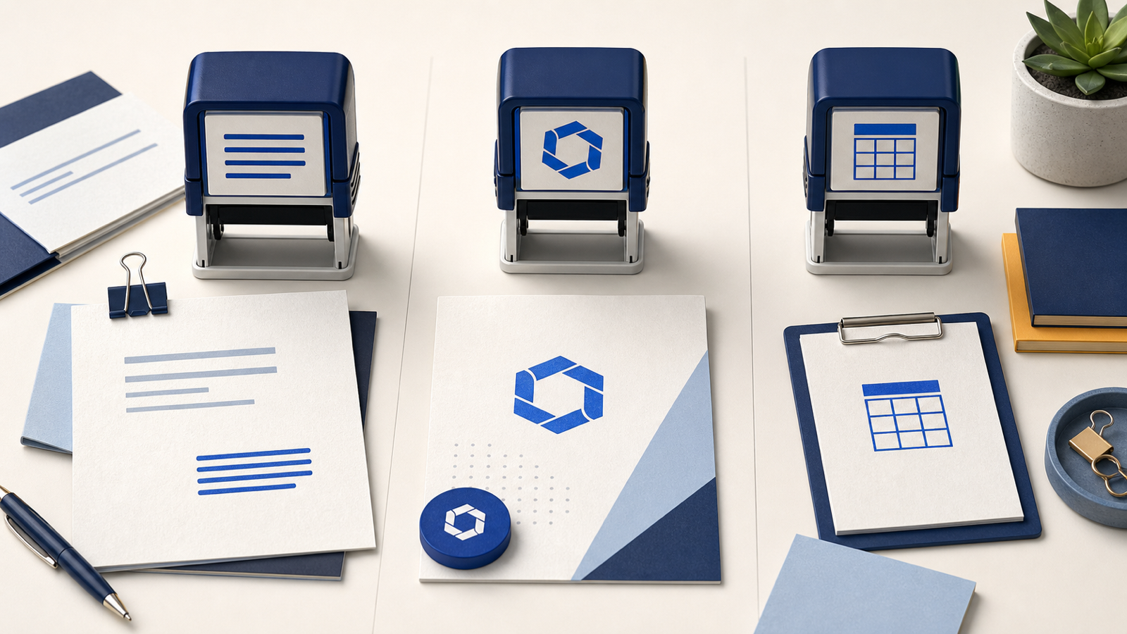
A text stamp, a logo stamp, and a date stamp can all sit on the same office desk, but they solve different problems. One repeats information accurately. One identifies a brand or organization. One records when an action happened. Choosing between them becomes easier when the decision starts with the job rather than the appearance of the sample.
Many crowded stamp designs come from trying to make one plate do all three jobs. A long address is wrapped around a logo, a date is squeezed into the center, and an approval phrase is added wherever a gap remains. The result may contain every requested item while making none of them quick to read. A better tool has a clear primary action and only enough supporting information to make that action trustworthy.
Start with the action that repeats
Watch the real workflow for a day. What does a person write or place repeatedly? A receiving team may write the same company name and delivery status on every package. An accounts team may mark invoices as paid and add a date. A customer-service group may add a return address to envelopes. A quality team may apply a recognizable inspection mark and then initial beside it.
Write the repeated action as a plain sentence: “We need to add our return address,” “We need to show that this document was approved,” or “We need to record the received date.” That sentence identifies the main stamp type. Brand recognition, decorative style, and secondary details can be considered after the core action is clear.
Also note who will use the stamp and how quickly. A front desk processing dozens of forms needs instant orientation and little room for error. A craft maker packaging a small number of orders may value a distinctive logo impression more than speed. A stamp that fits one context can be awkward in another even when the printed artwork is identical.

Choose a text stamp for repeated information
A text stamp is the straightforward choice when the value comes from repeating words or numbers accurately. Return addresses, department names, contact details, approval phrases, account references, shipping instructions, and routine status labels all belong in this category. The design should behave like a well-set label: clear hierarchy, sensible line breaks, and no decorative element that competes with the message.
Text stamps are especially useful when handwriting creates delays or inconsistencies. A four-line address can be applied in a second, with the same spelling and layout every time. A standard “received in good condition” phrase reduces variation between staff members. The benefit is operational before it is visual.
Keep each line short enough to read at a glance. Break an address where a reader expects a break, not merely where the editor runs out of width. Put the organization name on its own line if it is the primary identifier. Use a smaller size for phone, email, or registration information. If every line is the same weight and length, the block can feel dense even when it technically fits.
Explore the text stamp templates when the job is mainly verbal. They provide starting structures for centered labels, short status marks, and multi-line information without forcing a brand symbol into the layout.
When a text stamp is the wrong tool
A text stamp becomes a poor fit when recognition depends on a distinctive visual mark. Typing the company name in a generic bold font is not the same as applying the approved brand signature. It can also be the wrong choice when information changes on every use. A fixed plate cannot efficiently handle a different date, batch code, or reviewer name unless those values are written separately.
Do not compress a long paragraph into a small stamp. Terms, disclaimers, and detailed instructions are better printed as part of the document or label. A stamp should communicate a short, repeatable state. If a person must pause to read six narrow lines, it is no longer saving meaningful time.
Text can still support another stamp type. A logo stamp may include a short website address. A date stamp may include “received” or a department name. The distinction comes from which element performs the main job.
Choose a logo stamp for recognition and ownership
A logo stamp places a recognizable visual identity on packaging, cards, tissue paper, certificates, proofs, or internal documents. It is useful for small businesses that want consistent branding without printing a custom run of every material. It can also mark ownership, authorship, or approval when the symbol is already understood by the audience.
The best source is a clean brand mark, not a screenshot from a website or a photo of an existing stamp. Simple vector artwork converts well because its edges and proportions are defined. A high-resolution transparent image can also work, but it should be inspected carefully for soft edges and background pixels.
A stamp impression is usually one color, so the logo must remain identifiable without color differences, gradients, shadows, or fine photographic detail. Test the mark in solid black first. If parts disappear or merge, simplify it. This may mean removing a tagline, opening small gaps, thickening a line, or using a dedicated one-color version supplied by the brand designer.
The logo stamp templates show ways to give the mark enough space while keeping optional text subordinate. Begin with the logo alone before adding borders, stars, or a surrounding company name. Recognition is strongest when the symbol is not fighting a frame.
Respect the logo’s clear space
Most brand marks need empty space around them. On a stamp, that clear space also protects the image from ink spread and nearby borders. A circle drawn very close to the logo can make the two shapes merge. Curved text that touches a wide symbol can turn the center into a solid block.
Use the brand’s clear-space rule if one exists. If it does not, begin with a margin roughly equal to a meaningful internal part of the mark, such as the height of a letter or the width of a central shape. Print a small proof and reduce the margin only if the result still reads cleanly.
Do not distort the logo to fill the available plate. Lock its proportions. If a horizontal mark leaves empty space above and below in a round housing, accept that space or choose a rectangular plate. Stretching the artwork may fill the circle, but it weakens the identity the stamp was meant to preserve.
Choose a date stamp when time is the record
A date stamp is the correct tool when the changing date is the evidence: received mail, approved forms, processed invoices, inspection records, library returns, stock checks, and shipping paperwork. The design must keep the date field obvious and easy to align. Supporting words explain the event, but the date is the part a reader will search for later.
Some date stamps use movable bands or a configurable mechanism. Others are digital designs created for a specific date or document set. In either case, leave enough open area around the date so changing numerals do not collide with fixed text. A decorative border should not make a 2026 look like 2028 when the impression is light.
Use concise language such as “received,” “paid,” “approved,” or “inspected.” If the workflow also needs a signature or initials, leave a nearby blank line on the document rather than shrinking the date to make room inside the stamp. The record is clearer when fixed and handwritten information have distinct places.
Start from the date stamp layouts when the date is central. Their structure is more useful than adapting a company badge because the space for the changing value is planned from the beginning.
Fixed date artwork versus a changing date mechanism
A fixed-date digital stamp suits certificates, campaign graphics, event materials, and document batches that all share one date. It offers complete control over type and alignment. It is not efficient for daily receiving work because a new file or plate would be needed each day.
A changing date mechanism is practical for ongoing operations. Its typography and spacing are constrained by the hardware, so design the fixed words around the available date window. Ask the supplier for the actual impression dimensions and a template if possible. Do not estimate the band height from a product photograph.
For digital approval systems, the displayed date may be generated by the application rather than embedded in the artwork. Keep the brand or approval mark separate from the variable record when the system needs to audit changes. A visually combined image may look neat while losing useful metadata.
Use more than one stamp when the actions differ
A receiving department may genuinely need both identity and time: a company mark for ownership and a date mark for intake. That does not automatically require one combined plate. Two compact stamps can be clearer, easier to replace, and more flexible. If the address changes, the date tool remains usable. If the process changes from “received” to “verified,” only the status stamp needs revision.
Separate tools also support different placements. The logo can sit on the outside of packaging while the date belongs on an internal checklist. Combining them would either duplicate irrelevant information or force one awkward location.
A combined design is sensible when the elements are always used together and the layout remains readable. A “received” stamp with a central date field is a natural unit. A small logo with a short return address may also work. Combine by workflow, not because the plate has spare space.
Compare the maintenance cost
Every fixed detail can become outdated. Phone numbers change, office addresses move, departments are renamed, and logos are refreshed. A text stamp containing many details has a higher maintenance burden than one with a stable company name. A logo stamp tied to current brand artwork must be replaced when the brand changes. A date mechanism requires regular adjustment but not new artwork.
Before adding information, ask who will notice when it becomes wrong. A rarely used fax number can remain on a stamp for years because no one owns the update. Removing unnecessary data reduces both visual clutter and future replacement cost.
Save the editable design, approved dimensions, and order details in one place. Name the file by function rather than by a vague version number. “Warehouse-received-date-38mm” is easier to maintain than “stamp-final-new.”
Design rules shared by all three types
Every stamp needs a clear primary element, enough contrast, durable line weights, and space for ink behavior. Use one or two typefaces, not a collection. Keep very small text away from heavy borders. Avoid narrow gaps that can close on absorbent paper. Test the artwork at the actual size instead of trusting a large preview.
Color should not carry essential meaning if the physical impression may be made in one ink. A red “urgent” label shown in a blue impression must still communicate through the word and hierarchy. A multicolor logo must have a one-color version that remains recognizable.
Orientation matters in repeated work. A rectangular text stamp makes its top edge obvious. A symmetrical round logo may be applied upside down unless the housing has a clear guide. Add an orientation mark to the physical handle or choose a small asymmetric detail that helps the operator align it without weakening the design.
Test with the people who will use it
Print the proposed impression at actual size and give it to a user without explaining the design. Ask what they notice first, where they would place it, and whether any information is hard to read. Then simulate several real applications. A design used once can feel fine while one repeated fifty times reveals alignment or orientation problems.
For a text stamp, check reading speed and line order. For a logo stamp, check recognition at a glance and on the least forgiving material. For a date stamp, check whether the changing value is distinct and whether the operator can set and verify it quickly.
Invite one person from outside the immediate team to read the impression. Familiar users often fill in unclear letters from memory. Someone without that context provides a more honest legibility test.
Match the plate and ink to the surface
Paper documents, coated packaging, fabric, wood, and glossy labels do not accept ink in the same way. The design and physical stamp must be paired with an ink and surface that suit one another. Fine logo details that work on smooth card may break on kraft paper. A large text stamp may need firmer, even pressure to avoid a weak center.
Ask the supplier about the intended material and ink. If several surfaces are used, proof the most difficult one. Consider simplifying the design or increasing line weight for porous stock. Do not assume that a clean office-paper test guarantees a clean impression on packaging.
Digital stamps avoid physical ink behavior but face their own constraints: resolution, transparency, software compatibility, and consistent placement. Keep a high-quality source and approved templates for common documents.
A decision guide for common situations
- Return address on envelopes: choose a text stamp, optionally with a small simplified logo.
- Brand mark on packaging: choose a logo stamp with generous clear space and a one-color design.
- Incoming mail record: choose a date stamp with “received” as supporting text.
- Invoice approval: choose a short text status or a date stamp, leaving room for initials if required.
- Certificate authentication: choose a logo or company-seal layout, with the date handled separately unless it is fixed.
- Quality inspection: choose a concise text or logo identifier and record variable details outside the fixed plate.
If the situation still seems to require everything, sketch two versions: one combined and one split into separate tools. Compare the reading speed, impression size, replacement cost, and number of times each element is actually needed. The simpler option usually becomes obvious on paper.
Choose the function, then the style
Browse the broader stamp template collection after the primary function is settled. A template should accelerate a known job, not decide the job on the user’s behalf. Replace sample wording, simplify the hierarchy, and remove decorative elements that do not help the real workflow.
A text stamp earns its place by repeating information cleanly. A logo stamp earns its place through recognition. A date stamp earns its place by creating a reliable time record. When one of those actions is clearly primary, the right layout, size, and export become much easier to choose. When two actions are equally important, two focused stamps can be a better system than one overloaded impression.
Document the choice
Give the finished tool a functional name, record its dimensions, and note who owns updates to its wording or artwork. A short record prevents a logo stamp from being used as an official approval mark or an old address stamp from returning to service after a move. Clear ownership is part of choosing the right stamp, because the best design remains useful only while its information and purpose stay current.
