Good address stamp design makes a repetitive task feel almost invisible. The stamp lands, the recipient can read it, and the envelope or parcel moves on. Poor design creates small delays every time: a postal code is hard to find, a long street line crowds the border, or the business name looks like part of the address. Those problems rarely come from a lack of style. They come from trying to fit too much information into a small mark without deciding what deserves priority.
Treat the stamp as a compact information system. First choose the exact job. Then edit the wording, build a clear hierarchy, and test the result at its physical size. Decorative choices come later. The same order works for return addresses, shipping desks, property managers, independent professionals, and small shops that want a consistent sender mark without turning every envelope into a branding exercise.
Address stamp design begins with one specific job
Write down where the stamp will be used before opening an editor. “For the business” is too broad. “For the return-address corner of C5 envelopes” is useful. So is “for the sender block on plain cardboard mailers” or “for the property office address on tenant notices.” The surface and the repeated task tell you how much room you have, how formal the mark should feel, and which line needs to be found first.
A return-address stamp usually needs fast identification rather than a large logo. A shipping-room stamp may need a department or returns code that customers never see. A professional office may want the trading name to lead, followed by an address that reads like ordinary correspondence. One stamp can sometimes serve several tasks, but do not assume it must. A narrowly useful stamp is better than a universal design that is awkward everywhere.
Collect three or four real examples of the item you will stamp. Include the smallest envelope, the busiest label, and any paper stock that behaves differently. Mark the dependable clear area with a pencil or a removable note. That physical boundary is more honest than an empty screen. It also exposes conflicts early, such as a signature line, postage zone, window, fold, or label edge that reduces the apparent space.
Decide what earns a line
Start with the minimum information needed for the job. A typical sender block may contain a business or personal name, street address, locality, region, and postal code. Country information may be useful for international mail and unnecessary for local correspondence. A department, unit, suite, or building name belongs only when it helps the item reach the correct place. A phone number, website, email address, registration number, slogan, and social handle are not automatic additions.
Read every proposed line as if you were the recipient. Does it help route, return, or identify the item? If not, it is competing with the address. Extra details also create maintenance work. A phone number changes, a slogan dates, and a web address may be rebranded. The fewer volatile elements the stamp contains, the longer the design remains dependable.
Keep the wording in the form people already use. Do not invent abbreviations merely to make the layout fit. If your organization has an approved postal format, use that. If several address versions are circulating, choose one source of truth before designing. Correcting the source text after the mark is balanced can change every line length and force a second layout pass.
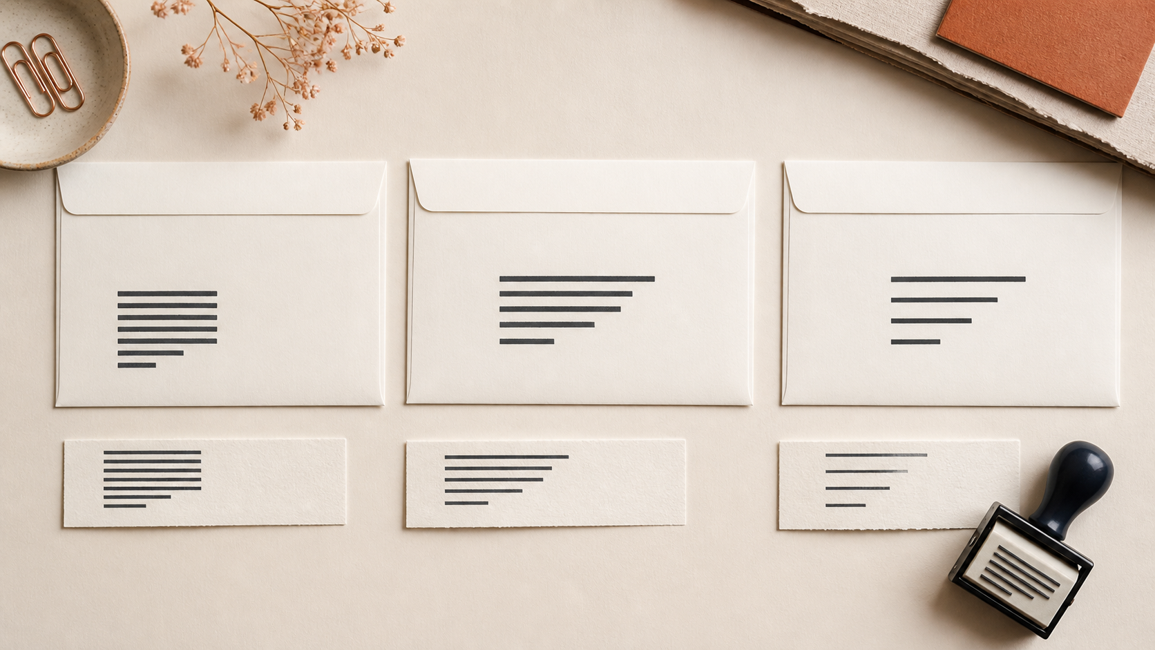
A useful editing exercise is to prepare three versions. The essential version includes only routing information. The standard version adds the sender name. The extended version adds one genuinely useful secondary detail, such as a department. Compare them at final size. In many cases, the standard version feels more confident than the extended one because every line has room to breathe.
Build hierarchy before adding style
Hierarchy tells the eye where to begin. On a business return-address stamp, the company name may be the first line because it identifies the sender. The address then forms a quieter block beneath it. For a personal return address, the name and street line may use similar emphasis. A shipping department code may need to stand apart from customer-facing information. Decide that order deliberately instead of making every line the same weight.
Use one main contrast at a time. The sender name can be slightly larger, slightly bolder, or separated by a little more space. It does not need all three. If the name is uppercase, the address can remain in normal capitalization. If a logo is present, the type can become quieter. Too many signals create several competing starting points.
Alignment should follow the content. Centered text can suit a short, formal block with lines of similar length. Left alignment is often easier for addresses with one long street line and a short locality line because each line begins at the same point. A compact logo beside left-aligned text may work in a wide rectangular stamp, but it reduces the width available to the address. Test the text-only arrangement first so the logo has to justify its space.
Use punctuation consistently. A mixture of centered dots, commas, vertical bars, and dashes looks busy at small sizes. Ordinary line breaks usually do more work than decorative separators. When two short items must share a line, choose a single quiet separator and leave enough space around it to survive imperfect inking.
Fit the layout to the physical footprint
An editor may show a stamp at several times its real size. Zoom can make thin gaps look generous and small letters look comfortable. Set a target physical width and height, then print or display a proof at that exact size. If you have not chosen dimensions yet, place several outlines on a page and cut them out. Put each outline on the smallest real item you collected earlier.
Leave a quiet margin inside the stamp. Text that nearly touches the outer edge feels cramped and is more vulnerable to an uneven impression. A border also consumes space; a double border consumes more. Measure the usable area inside those elements rather than treating the full stamp dimension as the text area.
Long lines should drive the width, but they should not force every other line to stretch. A street address can be the widest line without looking wrong. If one line is dramatically longer, consider a sensible line break, an approved abbreviation, or a wider stamp. Do not shrink all the type to solve one outlier unless the result remains clear at normal viewing distance.
Check the surrounding document as well as the mark. A design can be readable on a blank proof and still collide visually with a printed envelope pattern. Place the proof near postage, labels, windows, or preprinted return information exactly as it will be used. A few millimeters of extra separation can make the result feel intentional.
Choose type that tolerates real ink
Address stamps reward plain, sturdy letterforms. Look for open counters, distinct shapes, and moderate stroke weight. Extremely light type can break. Very heavy type can close small spaces. Narrow type may save width but can make a dense address feel like a barcode. A familiar sans serif or restrained serif is usually easier to proof than a display face designed for large headlines.
Avoid relying on tiny differences in weight. The screen may show a clear distinction between regular and medium, while ink spread reduces that contrast. Create hierarchy through size and spacing as well. If the company name is only slightly bolder than the address, make sure the design still works when both print with similar darkness.
Letter spacing needs restraint. Wide tracking can make a short name feel composed, but it also lengthens the line. Tight tracking may cause neighboring letters to merge. Pay special attention to pairs with narrow gaps, small punctuation, and characters with enclosed spaces. The postal code, suite number, and street number deserve the same care as the brand name because a single unclear character can matter more than a slightly imperfect logo.
Use uppercase for a reason, not as a default. It can give a short name a firm silhouette, yet a full address in capitals may become a dense rectangle. Mixed case often creates more varied word shapes, which can help scanning. Print both options if the choice is close.
Let the surface influence the design
Smooth office paper is forgiving. Textured envelopes, recycled mailers, and corrugated packaging are not. Fine rules and small counters can disappear into the surface. If the stamp will meet several materials, proof on all of them. The roughest common surface should influence the minimum detail, although it does not need to dictate a crude design.
Consider the stamping motion. A wide rectangular stamp needs even pressure across a larger area. A crowded design near the corners may expose a slight rocking motion. Give important information a little distance from the edge, and avoid placing the smallest line where pressure is least consistent in your normal technique.
Ink color changes contrast but does not rescue weak structure. A dark ink on a light surface is easy to assess. Colored paper, glossy labels, or patterned packaging may need a different method or a simpler mark. Test the actual combination instead of judging the ink pad and surface separately.
If the address stamp is primarily digital, the surface is the document background. A transparent image may sit over white, color, or a scanned page. Check that every part remains distinct without a white box around it. Keep a clean master and export a version appropriate to the software rather than copying an image from a screenshot.
Use the right amount of branding
An address stamp can carry brand character without becoming a miniature advertisement. The sender name, one typeface choice, and a restrained border may be enough. A logo is useful when it remains recognizable at the available size and does not push the address into cramped text. If the logo needs explanatory words to make sense, the full combination may be too complex for this mark.
Try the text block alone before adding a logo. Then add the mark at the smallest size where its internal spaces remain open. Compare the two versions from arm's length. If the logo makes the sender easier to identify and the address stays comfortable, keep it. If it merely fills empty space, the text-only version may look more professional.
Match the formality of the correspondence. A playful shop may use a rounded typeface and open border on outgoing parcels. A legal or property office may prefer quieter typography and no decorative motif. This is an editorial decision, not a universal rule. The useful test is whether the style supports the repeated job without slowing recognition.
For ideas, review the existing address stamp template and nearby business stamp examples. Treat them as starting points. Replace the sample content, then re-evaluate the hierarchy for your longest real line.
Create a master and controlled variants
Keep one master layout with verified wording, type settings, dimensions, and spacing. If different departments or locations need versions, duplicate the master and change only the fields that differ. This reduces the chance that every branch invents a slightly different border, type size, or line order.
Name files by purpose and version, not by vague labels such as “final-new.” Include the location or department and an approval date where that helps your internal process. Store the source separately from exported files. A clean source makes future address changes easier and prevents repeated editing of a flattened image.
Define who approves the address wording. A designer can improve spacing but should not guess whether a unit number is optional or which legal name belongs on correspondence. Capture the approved text in a plain document, then paste it into the design. This small boundary separates content responsibility from visual execution.
If you need several related marks, consider a compact system: a standard sender stamp, a returns stamp with a department line, and a small address-only version for tight spaces. Reuse type and spacing logic while letting each footprint solve its own job. Consistency does not require identical dimensions.
Proof the address, not just the artwork
A proofing session should include someone who did not build the design. Give them a normal-size print and ask them to read the address aloud. Do not explain the intended line breaks. Listen for hesitation around similar characters, punctuation, or abbreviations. A fresh reader finds problems the designer has learned to overlook.
Then compare every character with the approved source. Check the business name, street number, unit, city, region, postal code, and country. Confirm that the order matches the way the address is normally written for its destination. Visual polish cannot compensate for a wrong postal code.
Stamp several impressions rather than judging the best one. Use normal pressure and speed. The design should remain readable through ordinary variation, not only when carefully pressed on perfect paper. Look for letters that fill, corners that drop out, and lines that seem too close after ink spread. Adjust the design, not the user's hand, when the same problem repeats.
Place acceptable impressions on actual outgoing items. Check that there is room for labels, postage, handwritten notes, and barcodes used in your workflow. If staff members stamp in different locations, provide one simple placement rule that is easy to repeat.
Common address stamp mistakes and direct fixes
Everything has equal emphasis
When the business name, address, website, and slogan share one size and weight, the reader has no entry point. Choose one leading element and make the rest a supporting block. Remove a secondary item before adding more contrast.
The longest line controls the entire design
A single street or business name can force the type too small. Try an approved line break or a wider footprint. Do not stretch short lines or increase their tracking merely to imitate the longest line.
The border squeezes the address
A border may make the mark feel finished, but it is optional. Reduce its weight, increase the inner margin, or remove it. The address is the functional content and should win the space negotiation.
The screen proof is the only proof
Print at actual size and test on the real material. If physical production is planned, ask the producer about practical limits for the chosen method. A crisp enlarged preview is not evidence that every small detail will transfer cleanly.
Contact details turn the stamp into a mini flyer
Return to the job statement. Keep the information needed to identify and route the item. Put changing marketing details elsewhere unless the stamp has a separate promotional purpose and enough space to support it.
A practical workflow in an online stamp maker
Prepare the approved text and target dimensions first. Open the StampDr stamp design workspace, choose a rectangular canvas that reflects the real footprint, and enter the address in its intended line order. Establish the sender name and address hierarchy with size and spacing before experimenting with borders or decorative elements.
Print a first proof early. If a line feels tight, edit the content or footprint before shrinking everything. Add a logo only after the text block works. Test the final layout on the smallest and roughest common item, then save the source and export version with clear names.
The broader business stamp maker planning guide can help when the address stamp belongs to a larger office set. Use the same naming and approval logic across received, paid, date, and department marks so future updates do not become a scavenger hunt.
Make the next impression easy to trust
A clear address stamp is edited more than it is decorated. It contains the right information, gives the longest line enough room, keeps small characters open, and survives ordinary stamping on real materials. Its hierarchy can be understood in a glance, and its source can be updated without rebuilding the design.
Begin with one real envelope or parcel and one approved address. Build the smallest useful version, print it at actual size, and ask a fresh reader to read it aloud. If every line is effortless and the mark fits its surroundings, the design is ready to become part of the routine.
